STATISTICAL TESTS
Statistical tests are used to test assertions about populations. The aim is to determine whether there is enough evidence to reject a null hypothesis. This is shown by way of p-values.
How it works for continuous data?
For normal continuous data with one or two groups of interest, the t-test (paired or unpaired) is used to compare means. For non-normal data, non-parametric tests such as the Wilcoxon Test is used that compares ranks. For three or more groups, the ANOVA method (for normal data) compares the means with the help of variance calculations between groups and within groups. and Kruskal-Wallis test (for non-normal data) to compare ranks for non-normal data for calculations between groups and within groups.
library(tidyverse)
#> ── Attaching packages ─────────────────────────────────────── tidyverse 1.3.1 ──
#> ✔ ggplot2 3.3.6     ✔ purrr   0.3.4
#> ✔ tibble  3.1.7     ✔ dplyr   1.0.9
#> ✔ tidyr   1.2.0     ✔ stringr 1.4.0
#> ✔ readr   2.1.2     ✔ forcats 0.5.1
#> ── Conflicts ────────────────────────────────────────── tidyverse_conflicts() ──
#> ✖ dplyr::filter() masks stats::filter()
#> ✖ dplyr::lag()    masks stats::lag()
if (!require("openintro", quietly = TRUE))
    install.packages("openintro")
hip<-read.csv("../inst/extdata/hip_data.csv")
summary(hip)
#>        id            sex                 age           retired
#>  Min.   :  1.0   Length:708         Min.   :31.00   Min.   :0.0000
#>  1st Qu.:177.8   Class :character   1st Qu.:66.00   1st Qu.:0.0000
#>  Median :354.5   Mode  :character   Median :75.00   Median :1.0000
#>  Mean   :354.5                      Mean   :73.52   Mean   :0.5709
#>  3rd Qu.:531.2                      3rd Qu.:82.00   3rd Qu.:1.0000
#>  Max.   :708.0                      Max.   :99.00   Max.   :1.0000
#>                                                     NA's   :454
#>       ohs0            ohs6          ohsdiff          EQ5D0
#>  Min.   : 0.00   Min.   : 6.00   Min.   :-43.0   Min.   :-0.5940
#>  1st Qu.:13.00   1st Qu.:33.00   1st Qu.:-26.0   1st Qu.: 0.0550
#>  Median :20.00   Median :42.00   Median :-19.0   Median : 0.5160
#>  Mean   :20.03   Mean   :38.63   Mean   :-18.6   Mean   : 0.3804
#>  3rd Qu.:26.00   3rd Qu.:46.00   3rd Qu.:-12.0   3rd Qu.: 0.6910
#>  Max.   :46.00   Max.   :48.00   Max.   : 19.0   Max.   : 1.0000
#>                                                  NA's   :18
#>      height          weight       satisfaction         bmi
#>  Min.   :1.080   Min.   : 44.0   Min.   :  0.00   Min.   : 0.0022
#>  1st Qu.:1.603   1st Qu.: 65.0   1st Qu.: 90.00   1st Qu.:23.4509
#>  Median :1.660   Median : 74.0   Median :100.00   Median :26.3465
#>  Mean   :1.667   Mean   : 76.1   Mean   : 89.22   Mean   :26.4614
#>  3rd Qu.:1.740   3rd Qu.: 86.0   3rd Qu.:100.00   3rd Qu.:30.3692
#>  Max.   :1.970   Max.   :186.0   Max.   :100.00   Max.   :63.4431
#>  NA's   :370     NA's   :359     NA's   :52       NA's   :359
#>   bmi_imputed           ethnic           side              imdscore
#>  Min.   : 0.00225   Min.   :0.0000   Length:708         Min.   : 0.92
#>  1st Qu.:23.26808   1st Qu.:0.0000   Class :character   1st Qu.: 7.07
#>  Median :26.68621   Median :0.0000   Mode  :character   Median :11.07
#>  Mean   :26.74399   Mean   :0.1501                      Mean   :13.82
#>  3rd Qu.:30.82529   3rd Qu.:0.0000                      3rd Qu.:18.86
#>  Max.   :63.44307   Max.   :1.0000                      Max.   :48.05
#>                     NA's   :355                         NA's   :11
For categorical data, the chi-squared test shows if the observed values in each sub-category differ to the expected values by chance or not.
Two-sample T-test or Wilcoxon-rank tests
T-tests or Wilcoxon-rank tests can be used to describe the association between two continuous variables.
Unpaired tests
Explore the distributions of ages in men and women
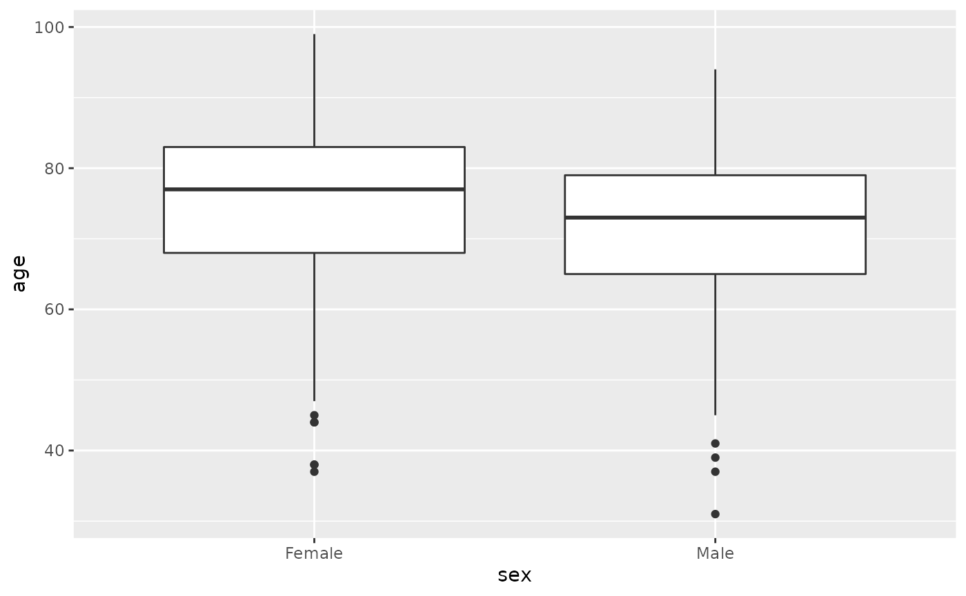
hip %>% filter(!is.na(sex)) %>% ggplot(aes(sex,height)) + geom_boxplot()
#> Warning: Removed 369 rows containing non-finite values (stat_boxplot).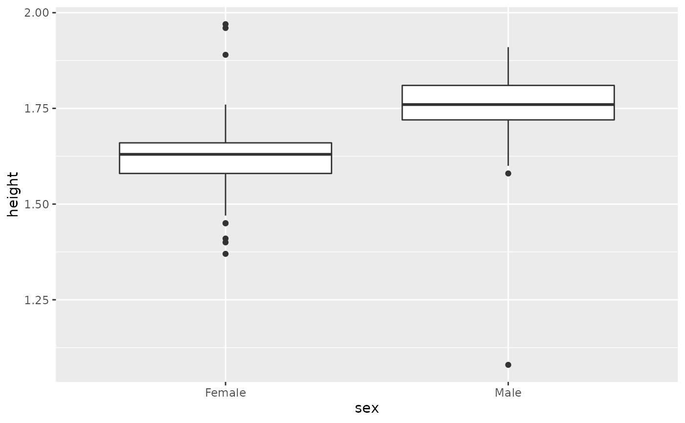
hip %>%
  select(height, weight, sex) %>%
   filter(!is.na(sex)) %>%
  pivot_longer(cols = c(height, weight)) %>%
  ggplot()+geom_boxplot(aes(sex, log10(value), fill=name))
#> Warning: Removed 727 rows containing non-finite values (stat_boxplot).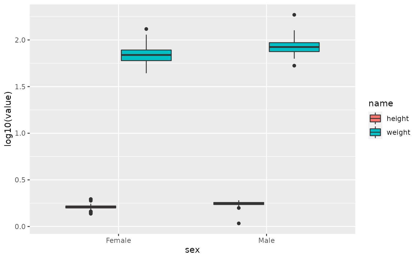
An unpaired t-test looks at whether the means of continuous variables differs between two groups. For example we could see whether there is an association between the average age of men and the average age of women. You can get the means with estimate and the p-value with p.value using the accessor $.
library(broom)
t<-t.test(age~sex,data=hip %>% filter(!is.na(sex)))
t
#>
#>  Welch Two Sample t-test
#>
#> data:  age by sex
#> t = 4.5196, df = 578.32, p-value = 7.517e-06
#> alternative hypothesis: true difference in means between group Female and group Male is not equal to 0
#> 95 percent confidence interval:
#>  2.228963 5.655140
#> sample estimates:
#> mean in group Female   mean in group Male
#>             75.05275             71.11070
tidy(t)
#> # A tibble: 1 × 10
#>   estimate estimate1 estimate2 statistic    p.value parameter conf.low conf.high
#>      <dbl>     <dbl>     <dbl>     <dbl>      <dbl>     <dbl>    <dbl>     <dbl>
#> 1     3.94      75.1      71.1      4.52 0.00000752      578.     2.23      5.66
#> # … with 2 more variables: method <chr>, alternative <chr>

t$estimate
#> mean in group Female   mean in group Male
#>             75.05275             71.11070
t$p.value
#> [1] 7.516598e-06
This indicates that there is a difference in the mean age of men and women of -3.9420512, and this difference is significant with a p.value of 7.5210^{-6}
The p-value from the t-test can be added to the boxplots using stat_compare_means from the library ggpubr.
library(ggpubr)
hip %>% filter(!is.na(sex)) %>% ggplot(aes(sex,age)) + geom_boxplot() + stat_compare_means(method = "t.test")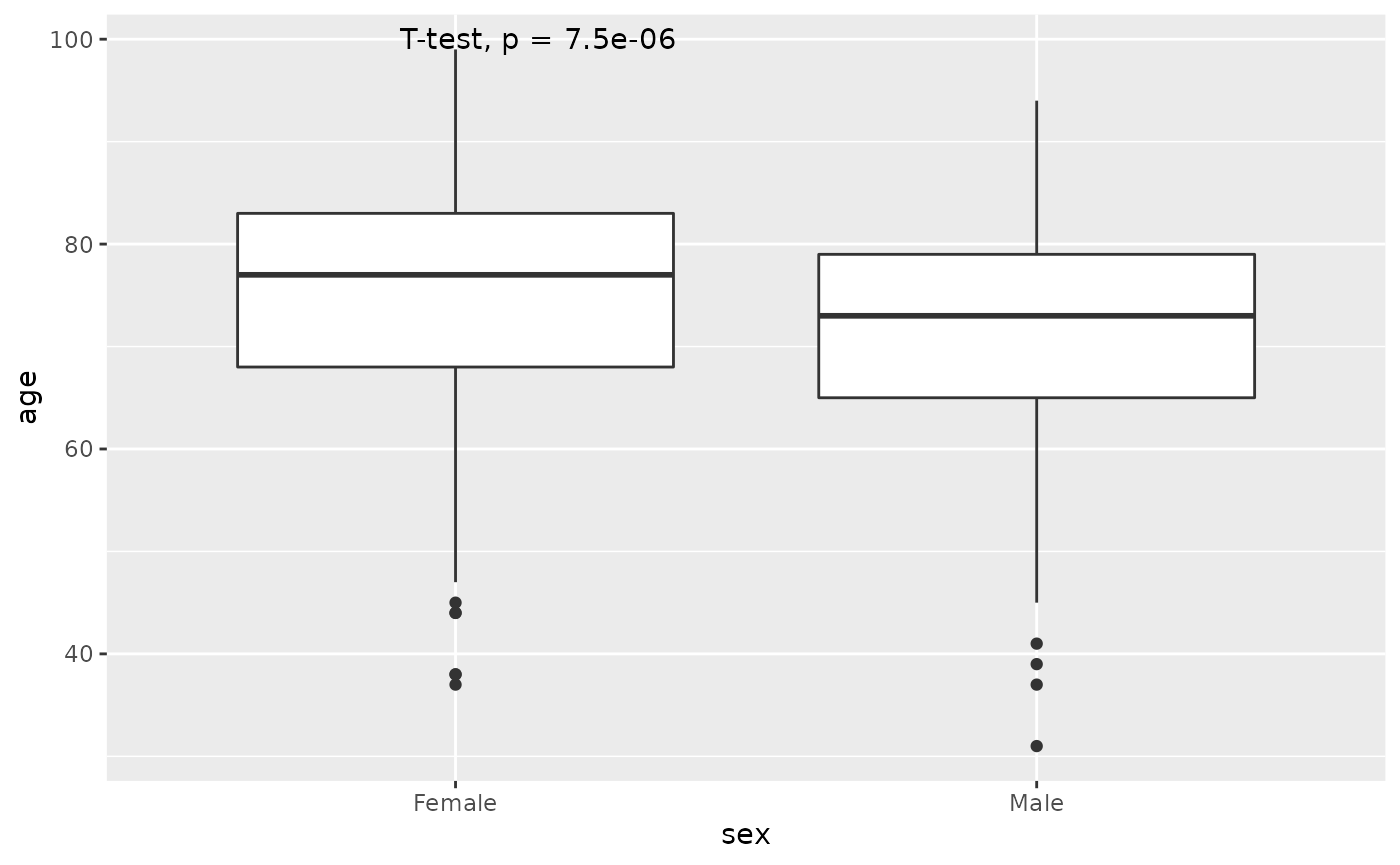
However, check the distribution of age in men and women separately using the histogram and qq-plot. It does not look normally distributed.
hip %>% filter(!is.na(sex)) %>% ggplot(aes(age, fill=sex)) + facet_grid(~sex) + geom_histogram()
#> `stat_bin()` using `bins = 30`. Pick better value with `binwidth`.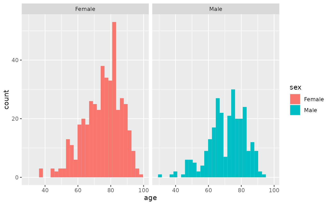
hip %>% filter(!is.na(sex)) %>% ggplot(aes(sample=scale(age), fill=sex)) + facet_grid(~sex) + geom_qq() + geom_abline() 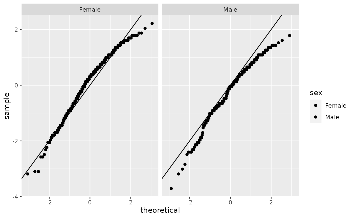
Instead of the t-test, one should use the Wilcoxon rank-sum test.
w<-wilcox.test(age~sex,data=hip %>% filter(!is.na(sex)))
w
#>
#>  Wilcoxon rank sum test with continuity correction
#>
#> data:  age by sex
#> W = 71138, p-value = 4.889e-06
#> alternative hypothesis: true location shift is not equal to 0

est<-hip %>% filter(!is.na(sex)) %>% group_by(sex) %>% summarize(median=median(age,na.rm=TRUE))
est
#> # A tibble: 2 × 2
#>   sex    median
#>   <chr>   <dbl>
#> 1 Female     77
#> 2 Male       73
This indicates that there is a difference in the median age of men and women of -4, and this difference is significant with a p.value of 4.8910^{-6}
Similarly, add the p-value to the boxplots using stat_compare_means from the library ggpubr. The Wilcox-test is the default method, so we do not need to add an argument to the funciton.
hip %>% filter(!is.na(sex)) %>% ggplot(aes(sex,age)) + geom_boxplot() + stat_compare_means()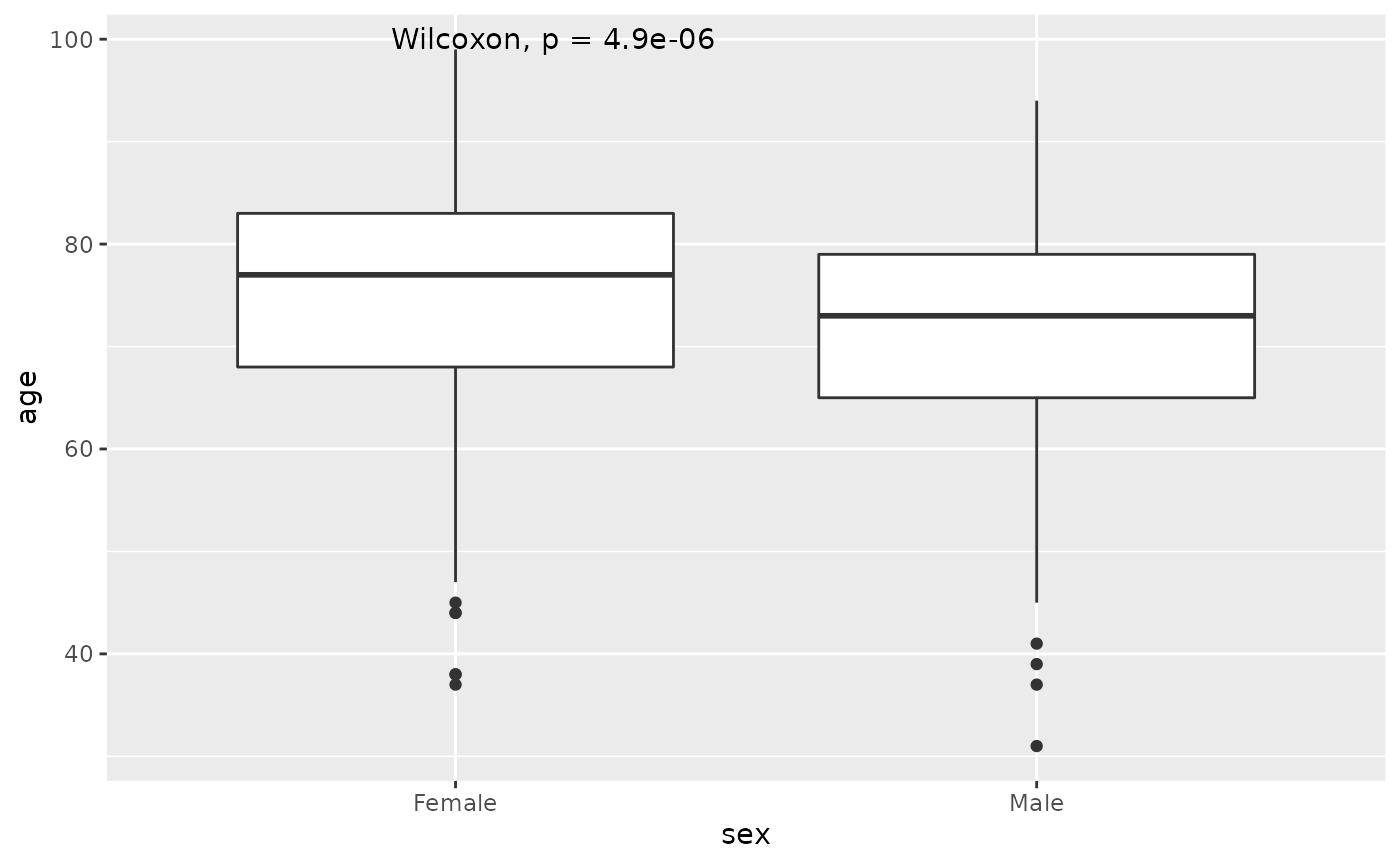
Paired tests
The paired t-test would be used to compare the difference in repeated measures on the same individuals. For example, in the dataset, Performance at baseline and 6-months are given by ohs0 and ohs6. Use a paired t-test to analyse the difference in the distributions. Note the extra paired argument in the t.test function. Use the using the accessor $ or pull to extract the relevant variables.
t<-t.test(hip$ohs0,hip$ohs6, paired=TRUE)
t
#>
#>  Paired t-test
#>
#> data:  hip$ohs0 and hip$ohs6
#> t = -45.865, df = 707, p-value < 2.2e-16
#> alternative hypothesis: true mean difference is not equal to 0
#> 95 percent confidence interval:
#>  -19.40091 -17.80813
#> sample estimates:
#> mean difference
#>       -18.60452

t$estimate
#> mean difference
#>       -18.60452
t$p.value
#> [1] 4.551803e-214
This indicates that there is a difference in the mean performance between baseline and 6 months of -18.6045198, and this difference is highly significant.
Calculate the difference between the performances at the 2 time points and use a histogram to represent the distribution. Use geom_vline to draw a dotted line at 0 to represent the Null distribution.
hip %>% mutate(diff=ohs6-ohs0) %>% ggplot(aes(diff)) + geom_histogram() +  geom_vline(xintercept = 0, lty=2)
#> `stat_bin()` using `bins = 30`. Pick better value with `binwidth`.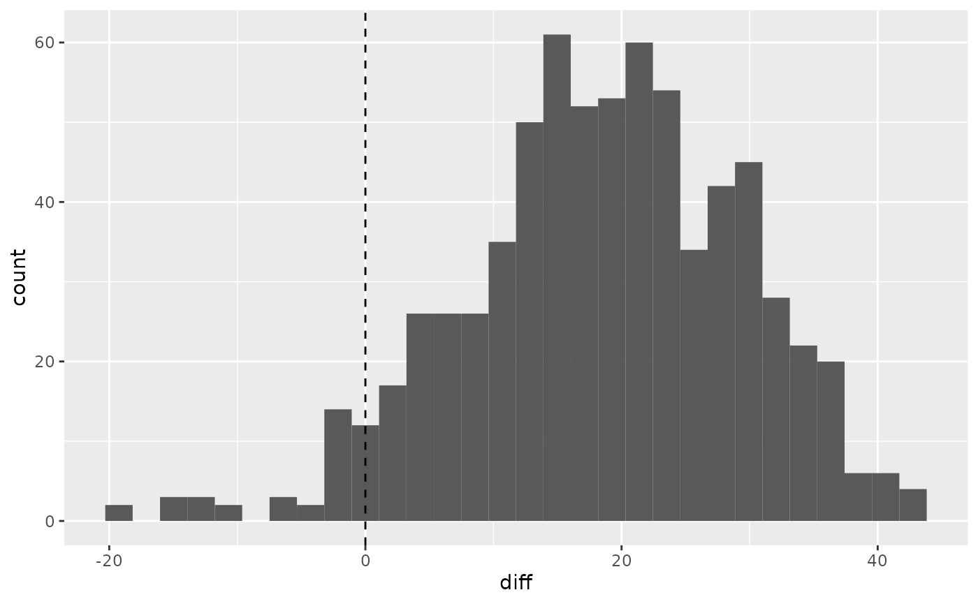
The non-parametric version is the Wilcoxon signed-rank test, and this is also significant.
w<-wilcox.test(hip$ohs0,hip$ohs6,paired=TRUE)
w
#>
#>  Wilcoxon signed rank test with continuity correction
#>
#> data:  hip$ohs0 and hip$ohs6
#> V = 2850, p-value < 2.2e-16
#> alternative hypothesis: true location shift is not equal to 0

w$p.value
#> [1] 2.184776e-111
ANOVA (Analysis of Variance)
A one-way ANOVA can be used when there are more than two groups.
For example split the variable of satisfaction into 3 groups.
hip<-hip %>% mutate(satisfaction.cat=factor(ifelse(satisfaction<80,"Low",ifelse(between(satisfaction,80,90),"Medium","High")), levels=c("Low","Medium","High")))

hip %>% pull(satisfaction.cat) %>% table()
#> .
#>    Low Medium   High
#>     87    185    384
Run an ANOVA to test the relationship between age and satisfaction.cat
a<-aov(age~satisfaction.cat,data=hip)

s<-summary(a)

s
#>                   Df Sum Sq Mean Sq F value Pr(>F)
#> satisfaction.cat   2    396   198.2   1.482  0.228
#> Residuals        653  87324   133.7
#> 52 observations deleted due to missingness
This suggests that there is very little evidence that satisfaction groups are different with respect to age. with a p-value of 0.228
Chi-squared test
To look at the association between two categorical variables we can perform a chi squared test Study the relationshipo between sex and satisfaction.cat using a contingency table and a bar plot.
hip %>% filter(!is.na(satisfaction.cat)) %>% filter(!is.na(sex)) %>% ggplot(aes(sex,fill=satisfaction.cat)) + geom_bar(position="dodge")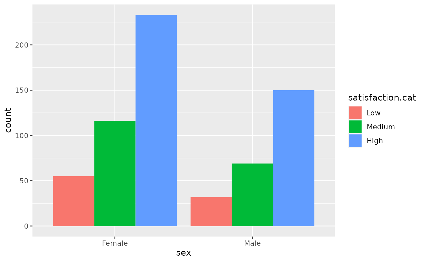
t <- hip %>% select(sex,satisfaction.cat) %>% table()
t
#>         satisfaction.cat
#> sex      Low Medium High
#>   Female  55    116  233
#>   Male    32     69  150
Use prop.table and geom_bar(stat="identity") to report the relative frequencies of satisfaction between the sexes.
p<-prop.table(t, margin =1)

p %>% as.data.frame() %>% ggplot(aes(x=sex,y=Freq,fill=satisfaction.cat)) + geom_bar(stat="identity")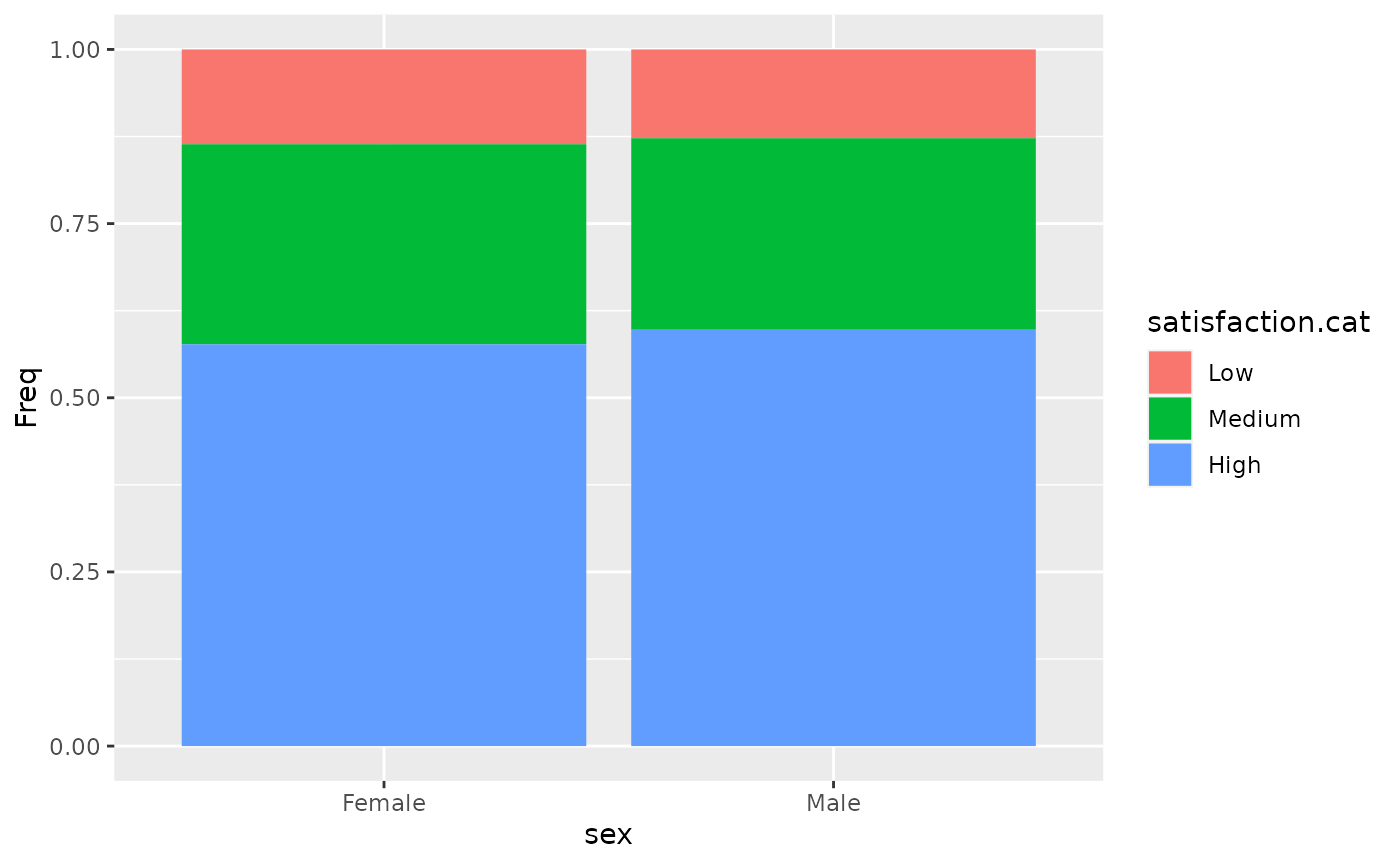
Test this relationship using the chi.test command on the contingency table.
c<-chisq.test(t)
c
#>
#>  Pearson's Chi-squared test
#>
#> data:  t
#> X-squared = 0.28454, df = 2, p-value = 0.8674
The relative risks are close to 1. Alongwith the test, this indicates that there is very little evidence of a relationship between satisfaction.cat and sex, with a p.value of 0.8674.
Exercise
Check whether there is a difference in the performance at baseline
ohs0between the males and females. Study the distributions and decide which test to use.We used an ANOVA to study the distribution of satisfaction.cat and age. Check the distribution of age over the 3 satisfaction.cat groups. Does it pass normality assumptions? If you are unsure, use Kruskal-Wallis test. Hint you can get information using
?kruskal.test.Use ANOVA or Kruskal-Wallis test to check if there is an association between baseline ohs0 and satisfaction.cat groups.
Create a table of retired against satisfaction groups. Does the chi-square test show an association between the two?
Linear associations
The data we’re working with is in the openintro package and it’s called hfi, short for Human Freedom Index.
What type of plot would you use to display the relationship between the personal freedom score, pf_score, and pf_expression_control? Plot this relationship using the variable pf_expression_control as the predictor. Does the relationship look linear? If you knew a country’s pf_expression_control, or its score out of 10, with 0 being the most, of political pressures and controls on media content, would you be comfortable using a linear model to predict the personal freedom score?
If the relationship looks linear, we can quantify the strength of the relationship with the correlation coefficient.
hfi_2016 <- hfi %>%
  filter(year == 2016)


hfi_2016 %>%
  ggplot()+geom_point(aes(pf_expression_control, pf_score))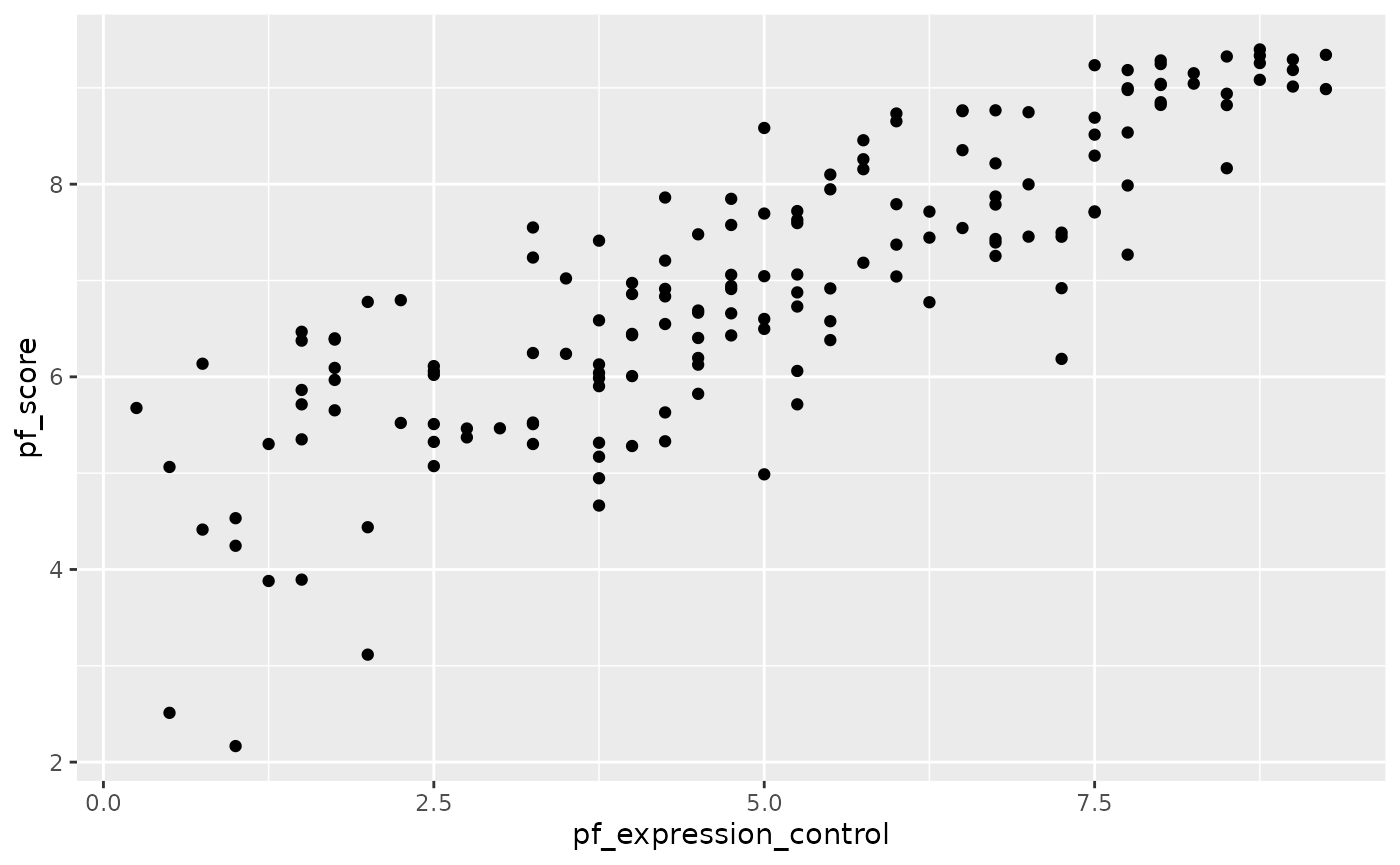
hfi_2016 %>%
  summarise(cor(pf_expression_control, pf_score))
#> # A tibble: 1 × 1
#>   `cor(pf_expression_control, pf_score)`
#>                                    <dbl>
#> 1                                  0.845
Correlation is not causation!!!

Linear regression
m1 <- lm(pf_score ~ pf_expression_control, data = hfi_2016)The first argument in the function lm() is a formula that takes the form y ~ x.
The output of lm() is an object that contains all of the information we need about the linear model that was just fit. We can access this information using the tidy() function.
tidy(m1)
#> # A tibble: 2 × 5
#>   term                  estimate std.error statistic  p.value
#>   <chr>                    <dbl>     <dbl>     <dbl>    <dbl>
#> 1 (Intercept)              4.28     0.149       28.8 4.23e-65
#> 2 pf_expression_control    0.542    0.0271      20.0 2.31e-45
summary(m1)
#>
#> Call:
#> lm(formula = pf_score ~ pf_expression_control, data = hfi_2016)
#>
#> Residuals:
#>      Min       1Q   Median       3Q      Max
#> -2.65911 -0.49491  0.04574  0.52073  1.59064
#>
#> Coefficients:
#>                       Estimate Std. Error t value Pr(>|t|)
#> (Intercept)             4.2838     0.1490   28.75   <2e-16 ***
#> pf_expression_control   0.5419     0.0271   19.99   <2e-16 ***
#> ---
#> Signif. codes:  0 '***' 0.001 '**' 0.01 '*' 0.05 '.' 0.1 ' ' 1
#>
#> Residual standard error: 0.7993 on 160 degrees of freedom
#> Multiple R-squared:  0.7141, Adjusted R-squared:  0.7123
#> F-statistic: 399.7 on 1 and 160 DF,  p-value: < 2.2e-16
Let’s consider this output piece by piece. First, the formula used to describe the model is shown at the top, in what’s displayed as the “Call”. After the formula you find the five-number summary of the residuals. The “Coefficients” table shown next is key; its first column displays the linear model’s y-intercept and the coefficient of pf_expression_control. With this table, we can write down the least squares regression line for the linear model:
\[ \hat{y} = 4.28 + 0.542 \times pf\_expression\_control \]
This equation tells us two things:
- For countries with a
pf_expression_controlof 0 (those with the largest amount of political pressure on media content), we expect their mean personal freedom score to be 4.28. - For every 1 unit increase in
pf_expression_control, we expect a country’s mean personal freedom score to increase 0.542 units.
We can assess model fit using \(R^2\), the proportion of variability in the response variable that is explained by the explanatory variable. We use the glance() function to access this information.
glance(m1)
#> # A tibble: 1 × 12
#>   r.squared adj.r.squared sigma statistic  p.value    df logLik   AIC   BIC
#>       <dbl>         <dbl> <dbl>     <dbl>    <dbl> <dbl>  <dbl> <dbl> <dbl>
#> 1     0.714         0.712 0.799      400. 2.31e-45     1  -193.  391.  400.
#> # … with 3 more variables: deviance <dbl>, df.residual <int>, nobs <int>
For this model, 71.4% of the variability in pf_score is explained by pf_expression_control.
Prediction and prediction errors
Let’s create a scatterplot with the least squares line for m1 laid on top.
ggplot(data = hfi_2016, aes(x = pf_expression_control, y = pf_score)) +
  geom_point() +
  geom_smooth(method = "lm", se = FALSE)
#> `geom_smooth()` using formula 'y ~ x'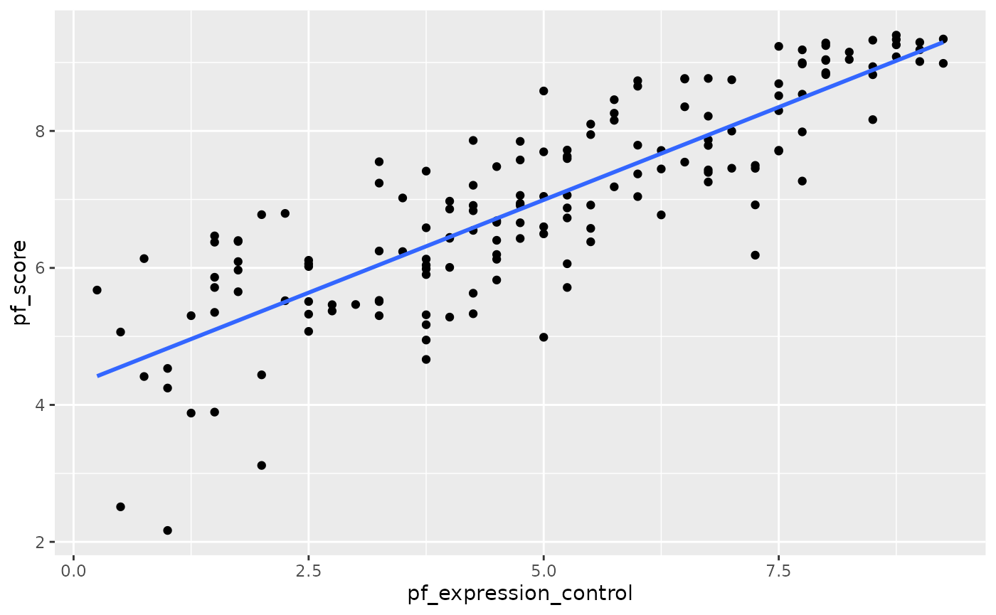
Here, we are literally adding a layer on top of our plot. geom_smooth creates the line by fitting a linear model. It can also show us the standard error se associated with our line, but we’ll suppress that for now.
This line can be used to predict \(y\) at any value of \(x\). When predictions are made for values of \(x\) that are beyond the range of the observed data, it is referred to as extrapolation and is not usually recommended. However, predictions made within the range of the data are more reliable. They’re also used to compute the residuals.
Model diagnostics
To assess whether the linear model is reliable, we need to check for (1) linearity, (2) nearly normal residuals, and (3) constant variability.
In order to do these checks we need access to the fitted (predicted) values and the residuals. We can use the augment() function to calculate these.
m1_aug <- augment(m1)###Linearity###
You already checked if the relationship between pf_score and pf_expression_control is linear using a scatterplot. We should also verify this condition with a plot of the residuals vs. fitted (predicted) values.
ggplot(data = m1_aug, aes(x = .fitted, y = .resid)) +
  geom_point() +
  geom_hline(yintercept = 0, linetype = "dashed", color = "red") +
  xlab("Fitted values") +
  ylab("Residuals")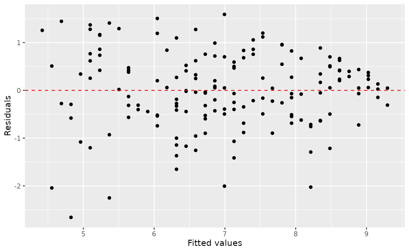
Notice here that m1 can also serve as a data set because stored within it are the fitted values (\(\hat{y}\)) and the residuals. Also note that we’re getting fancy with the code here. After creating the scatterplot on the first layer (first line of code), we overlay a red horizontal dashed line at \(y = 0\) (to help us check whether the residuals are distributed around 0), and we also rename the axis labels to be more informative.
Is there any apparent pattern in the residuals plot? What does this indicate about the linearity of the relationship between the two variables?
###Nearly normal residuals###
To check this condition, we can look at a histogram of the residuals.
ggplot(data = m1_aug, aes(x = .resid)) +
  geom_histogram(binwidth = 0.25) +
  xlab("Residuals")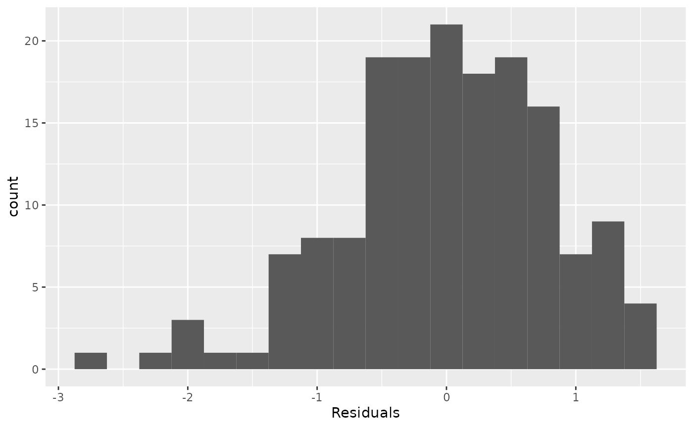
Based on the histogram, does the nearly normal residuals condition appear to be violated? Why or why not?
Constant variability
ggplot(data = m1_aug, aes(x = .fitted, y = .std.resid)) +
  geom_point() +
  geom_hline(yintercept = 0, linetype = "dashed", color = "red") +
  xlab("Fitted values") +
  ylab("SD Residuals")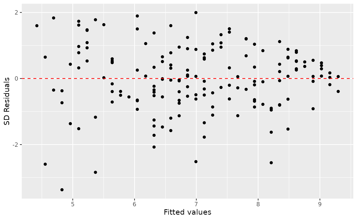
Based on the residuals vs. fitted plot, does the constant variability condition appear to be violated? Why or why not?
EXERCISES
1. Fit a new model that uses pf_expression_control to predict hf_score, or the total human freedom score. Using the estimates from the R output, write the equation of the regression line. What does the slope tell us in the context of the relationship between human freedom and the amount of political pressure on media content?
2. If someone saw the least squares regression line and not the actual data, how would they predict a country’s hf_score for one with a 3 rating for pf_expression_control? Is this an overestimate or an underestimate, and by how much? In other words, what is the residual for this prediction?
3. How does this relationship compare to the relationship between pf_score and pf_expression_control? Use the \(R^2\) values from the two model summaries to compare. Does your pf_expression_control seem to predict hf_score better? Why or why not?
4. Check the model diagnostics using appropriate visualisations and evaluate if the model conditions have been met.
5. Pick another pair of variables of interest and visualise the relationship between them. Do you find the relationship surprising or is it what you expected. Discuss why you were interested in these variables and why you were/were not surprised by the relationship you observed.
MULTIVARIABLE REGRESSION

EXERCISES
1. Copy your model from the previous exercise that uses pf_expression_control to predict Human Freedom or hf_score. Using the tidy command, what does the slope tell us in the context of the relationship between human freedom and expression control in the country?
2. Add region to the model from Q1 using lm(hf_score ~ pf_expression_control + region, data = hfi_2016). What do you notice about the slope between human freedom and expression control? How has it changed from the previous model. Do you think region is a confounder, and think about reasons why this might be so?
3. Compare the \(R^2\) for the 2 models from Q1 and Q2. Is there an increase by adding region? Think about the definition of \(R^2\). What does this mean in this context?
4. Fit a new model that uses ef_money or monetary measure to predict hf_score. What does the slope tell us in the context of the relationship between human freedom and the economy in the country?
5. Again add region to the model from Q4. Compare the slope and \(R^2\) with the model from Q4.
6. Finally fit a model with ef_money and pf_expression_control as exposures and hf_score as outcome. Compare the slope and \(R^2\) from the models from Q1. Could ef_money be a confounder?
7. Use a linear regression model (and scatter plot) with ef_money as exposure and pf_expression_control as outcome, to study whether ef_money has an association with pf_expression_control as well. This might validate our finding that ef_money is a confounder between pf_expression_control as exposure and hf_score as outcome from Q6.